Econocasts

Tuesday, December 31, 2013

2013.12.31 Gold Cycle Chart

2013.12.31


The gold cycle model seems to be working out well, as can be seen from the previous prediction posted on 2013.11.29.  The model seems to be suggesting a major temporal low for the metal within the first quarter of 2014.


2013.11.29

Sunday, December 8, 2013

2013.12.06 XOI.X Cycle Chart


The XOI.X cycle model continues to suggest higher prices for the index, with a top developing at the 1900 +/- level in the June, 2014 time frame. Some of the weights of the smaller cycles were changed by the model run, and you can see the differences by comparing the current version with the previous version from 2013.11.01 shown below.


Saturday, November 30, 2013

2013.11.29 Gold Cycle Chart


The gold cycle model continues to show a low in the February/March 2014 time frame, as you can see comparing the current output to the previous cycle model chart from 2013.10.11 as shown below. However, the slight shift in cycle weights has moved the presumed low from the 1300 area to the 1150 area.


Thursday, November 28, 2013

2013.11.27 DJIA Cycle Model Chart and Z-score


According to this model, the DJIA is in bubble territory, at least as far as historical cycles that were used to construct it. The model may be defective, or it may be revealing a severe anomaly in the markets, as occurred several times in the past which all resolved to the downside.  To illustrate this point, I have placed a line at the current Z-score and extended to 1900. I look forward to the performance of the DJIA in December to resolve the issue.

Sunday, November 17, 2013

2013.11.15 Silver Cycle Model Chart


The silver cycle model continues to indicate lower prices for silver going into the end of the last quarter of 2013. I do not want to speculate on the reasons why the gold and silver cycle models are divergent in the 2014-2015 time frame.  They are constructed and computed independently of each other. On the other hand, they have both been convergent in the short term, suggesting that going forward, if one of the models is "wrong" this should emerge as a major divergence with predicted price as we move into first quarter 2014.

Saturday, November 2, 2013

2013.11.01 XOI.X Cycle Chart


The XOI.X model suggests a continued rise in the index to 1850 +/- topping in mid-2014.  For comparison purposes, the previous cycle model 2013.10.04 is shown below.


Monday, October 21, 2013

2013.10.21 Silver Cycle Chart


The silver cycle model continues to perform well. If the model is accurate, we should be seeing lower silver prices between now and the end of the year.

Saturday, October 19, 2013

2013.10.18 DJIA Cycle Chart


If the DJIA cycle model has any internal validity, based on cycle parameters of the price time series extracted by the model since 1896, the DJIA is once again at a much higher level than would be expected by historical standards. Readers can see the Z-score of the model deviations for comparison to other manic eras. On the other hand, it is also possible that the model is incapable of capturing the recent changes in liquidity managed by the Federal Reserve, and hence it is "broken." In any case, one soft interpretation is that the DJIA is much higher than cyclical patterns indicate it should be, and we should see a very severe correction in the next few months. Nevertheless, given the performance of this particular model to date, I would maintain a skeptical view of the prediction.

Saturday, October 12, 2013

2013.10.11 Gold Cycle Chart


Gold is following the predicted price cycle within model error. At this point, the predicted price is higher than the actual, suggesting some upwards pressure. The price attractor from now until the end of the year appears to be in the $1360 +/- area.

Saturday, October 5, 2013

2013.10.04 XOI.X Cycle Chart


According to the cycle model for XOI.X, there are strong seasonal and decadal pressures pushing prices to the 1700 range by the end of the year. For Elliotticians, prices at the end of 2013 might represent the end of a wave 3 advance which began in the Fall of 2012, and the start of a 4th wave correction before prices reach 1850 +/- by the middle of 2014, which would be the end of the 5th wave.

Sunday, September 29, 2013

2013.09.27 DJIA Cycle Chart


While the historical cycles discovered by the structural model suggest that the DJIA should be on its way down, market reality has intervened. Rather than scrap the model at this point, inasmuch as it continues to converge, I present it because I still have some lingering belief that historical business cycles, while they may be delayed by the extraordinary steps taken by the Federal Reserve bank, will at some point reassert themselves.

Monday, September 23, 2013

2013.09.20 Gold Cycle Chart


The gold cycle model suggests that gold prices will remain range bound between $1300 and $1400 through March/April 2014.

Sunday, September 22, 2013

2013.09.20 Silver Cycle Chart


The silver cycle model prediction suggests that the recent spike in silver prices is evanescent, as the price target for the end of 2013 is about 1600.

Saturday, September 7, 2013

2013.09.06 Silver Cycle Chart


The spike in silver prices is reversing, as previously suggested by the divergence between the model prediction and the actual price. The cycle model is seeing silver prices in the 1500 +/- range by the end of 2014. A major caveat is that, as some readers have pointed out, there is a large divergence between predicted silver and gold prices going forwards after early 2014. I will inform readers if either the silver model or the gold model start taking too many iterations to converge, which is usually a bad sign for the health of the model, and of the modeler, on occasion.

Monday, September 2, 2013

2013.08.30 Gold Cycle Chart


The gold cycle model is right on target, but that is more luck than anything else. There is an error associated with the price curve, but in this case 'the mean' prediction happens to lie on the actual price curve.  One can see this is not always the case!   From now until the end of the year, the model predicts gold to remain range bound in the 1400 +/- area. Once again, for Elliott enthusiasts, it looks like a Wave II is in the offing in early 2014, before a rise to 1800 +/- by the end of 2015; remembering that these models lose price accuracy faster than time accuracy in terms of turning points when looking forwards.

Sunday, September 1, 2013

2013.08.30 XOI.X Cycle Chart


The oil index cycle chart is in reasonable convergence with prices, and has been performing well if you look at the previous editions.  The model is suggesting higher prices going forward, with a lot of pressure building for a price jump the longer the divergence between the model and the actual price continues. One of the interesting things about this model is that it shares some cycles in common with gold, and it also has one cycle which is in line with the Pacific Decadal Oscillation, which now presages colder weather.

Saturday, August 31, 2013

2013.08.30 DJIA Cycle Chart


Historical price cycles for the DJIA have converged so that there is an unusual steep decline predicted to last until early 2014, with a target price level of 7700 +/-. The major caveat is that the Fed may continue its unprecedented policy of constructing a mirage of liquidity in the desert of insolvency. Hence, the best way to interpret this chart is that there are extremely strong historical factors pointing to a large drop in the DJIA. Whether or not it comes to pass in this time frame depends on whether the historical cycles resume on time, or whether the Fed can continue to put off the day of reckoning, with a historically low ratio of assets backing the liquidity which it has, supposedly, temporarily created via its bond buys.

Sunday, August 18, 2013

2013.08.16 Silver Cycle Chart


Here is the silver cycle update which includes the infamous z-score, measuring how far the prediction deviated from the actual price. The lines above and below the "0" on the right represent the variance from the mean in SD units from -5 to 5. The ovals show the last time since 2010 silver prices exhibited such anomalous behavior with respect to the model prediction, with a z-score < -4. This was very quickly followed by a reversion to the mean. Inasmuch as the silver cycle model has otherwise been relatively accurate, the message from a cyclical model point of view is that the current rise in silver prices will not be sustained.  On a completely different note, I hope some readers had a chance to catch the latest heavenly performance art in the form of the Perseid meteor shower last weekend.

Monday, August 12, 2013

2013.08.12 DJIA Cycle Chart


The DJIA price time series prediction shows very strong cyclical pressure to the downside. Nevertheless, the divergence of the actual price to the predicted price is now at a historically high level going back to 1896. Since the current rate of QE(n+1) is $85 billion a month, which is without historical parallel, this price prediction may not stand the test of a few months. One conjecture I have is that were QE to end tomorrow, I suspect the price prediction would be much more accurate.  I have tried to incorporate Fed POMO operations in the model, and they are worthless for the cyclical model I am using here in terms of increasing accuracy.

Added on 2013.08.14

From zerohedge


So perhaps in the very short run, 2009 - 2013, POMO has indeed altered the length of the business cycles  .

Wednesday, August 7, 2013

2013.08.07 Silver Cycle Chart


According to this model, silver prices should stabilize in the 1500 range until the end of the year, followed by a local maximum in the Spring, 2014, before resuming their downward course towards 1000 +/-.

Monday, July 22, 2013

2013.07.19 Gold Cycle Chart


The target gold price in the August-September time frame is $1460 +/-. However, I would not be surprised if the price overshoots the model prediction at the peak, given its past performance.

Saturday, July 20, 2013

2013.07.19 XOI.X Cycle Chart


As predicted by the cycle model, the oil index is rising from its June, 2012 low and heading to 2300 +/-  with a predicted peak occurring in June, 2014.

Tuesday, July 16, 2013

2013.07.14 DJIA Cycle Model


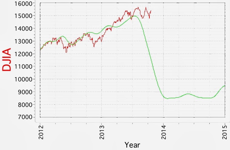
Saving the least predictive cycle model for last, here is the update for the DJIA. I probably should preface this particular model with some comments about what it represents.  The inputs to  the cycle models rely on  historical data. History rhymes and sometimes even repeats itself. However, the Fed asset buying and bailouts over the past four years are unprecedented in scope, so the model falls apart because there is no way to predict future Fed actions, and right ow the market is focused on Fed actions, rather than underlying business cycle fundamentals like credit, international capital flows, industrial production, etc.  And the market rules.

So why continue to run this model?  Well,  one way to interpret the prediction is that while on a historical basis there is very strong downward pressure on prices, the Fed has successfully, at least for now, inflated equity prices with enough liquidity to push back on seasonal, yearly and decadal patterns of business cycles, all of which have been pointing down for 4 years. Nevertheless, the model might give some quantitative indication of the amount of "pressure" the Fed has to exert to prevent the normal business cycles from re-exerting themselves.  If you look carefully at the Z-score charts, you will see that negative divergences in the  Z-score coincide with Fed bailouts and QE (n+1) announcements. So, if this hypothesis is correct, we should see the Fed announcing a creative way to continue to add liquidity to the banking system without spooking bond holders,  probably in the next few weeks. If the Fed does inject enough liquidity, and the bond markets do not get spooked, then it will provide another point of divergence for the model predictions.  However, if the Fed does nothing, or even thinks about removing liquidity by setting a timeline, the downward pressure on equity prices will reassert itself. 

For those not familiar with Z-scores, it is a way to look at how much variance there is between the predictions and the actual prices over time. A positive Z-score of 2 or 3  indicates that the predictions have exceeded actual prices by that margin 2.2 % of the time and 0.13% respectively.  The reverse operating for negative scores.  The Wiki page is good for a refresher course. The blue line on the second chart shows where we are with the Z-score at the moment, and you can see that on a historical basis it is quite remarkable. But does it mean an equity meltdown is coming up? I don't know, I guess I'll keep my eye on the Fed, like everyone else.

Friday, July 12, 2013

2013.07.12 Silver Cycle Chart


It appears that silver, like gold,  is also in the process of making a double bottom. 

Thursday, July 11, 2013

2013.07.11 Gold Cycle Chart


Gold is rising in accordance with the gold cycle model, or is it the other way around? The gold cycle model continues to suggest a "double-bottom" for gold, followed by a rise into 2014-2015. I am not a Elliott wave acolyte, but it even looks like a Wave 1 of a larger Wave V may have begun, which would put the next predicted low  in early 2014 as the bottom of Wave 2, followed by the strong impulsive Wave 3.

Wednesday, July 10, 2013

2013.07.09 XOI.X Cycle Chart


The XOI.X Amex Oil Index, one of the better performing cycle models as can be seen from historical charts, suggests strong upward pressure for prices over the next year. The usual caveat for this model is that it only incorporates cycles with a period of <15 years. However, given the strength of the signal, I think that the model will continue to perform reasonably well.

Saturday, June 22, 2013

2013.06.21 Cycle Charts


Since some readers like to print out these charts, I have changed the color scheme to make that a bit easier.According to the DJIA model, we are at the cusp of a major downside event. However, in the past, this was preempted by QE(n+1). Meanwhile, gold, silver and oil are performing well, though I wonder if the gold:silver ratio will really rise to the level suggested by the gold/silver predictions. For readers both in the Northern and Southern hemisphere: Happy Solstice!  I hope you all got out to enjoy the Supermoon.

Wednesday, June 5, 2013

2013.06.03 DJIA Cycle Model and Z-score


In case the reader has not followed the progress of the DJIA cycle model, I want to emphasize that of the four cycle models I present here, DJIA, Gold, Silver, and Oil, this is the least predictive model. I believe the reason is that the model looks at a conglomeration of historical business cycles since 1896 as reflected in the Dow Jones Industrial Average. The US Federal Reserve has been buying assets and expanding its balance sheet to the point where the process is now in uncharted territory. This has introduced an "error" in the model parameter estimates because the current level of asset buys dwarfs the last time the US Federal Reserve engaged in asset buying during and shortly after WWII. This error has not been transmitted to the other three models. At least not for now.

The z-score measures how much the prediction deviates from the actual price on a historical basis. The current Z-score shows that the model is deviating 2 sigmas from the mean, which is the largest deviation since 1929. All things being equal, the prediction would be for strong downward pressure on the Dow until early to mid 2014.

Saturday, June 1, 2013

2013.05.31 Silver Cycle Chart


It's a good cycle  model and it shows continued downward pressure on silver prices. if it continues, the effect would be to elevate the gold:silver ratio to extremes, but then again, given the extreme asset buys of the US FRB, ECB and BOJ, these are extreme times!

2013.05.31 XOI.X Oil Index


The Amex Oil Index model continues to perform well, as can be seen from its previous iterations. Note I have changed the axis limits for better resolution.

2013.05.31 Gold Cycle Chart


According to the gold cycle model, we are approaching a turning point at the end of this month.  If you refer to the longer term cycle charts, this may represent the first bottom of the "double-bottom" expected.  I am interested to see how the gold:silver ratio goes in the next few months, inasmuch as there is a lot of divergence between the two models at this point, at least for the short-term. 

Monday, May 6, 2013

2013.05.06 Silver Cycle Charts


Here are the updated charts for silver. The model continues to perform well, and suggests continued downward pressure on silver prices. A brief note to the gold and silver people that continue to post or e-mail me weird notions on how commodity markets run.  I'm not sure why gold and silver are the only two markets that attract this behavior; I have some theories but they are better left unsaid.  You may have noticed the blog is moderated, so you waste your time writing the post, and my time putting it in the spam bin. That is probably enough said for now.

If you have gotten this far, I'll make a note that market volatility is predicted to increase beginning this week in both short term and long-term models. You can download the long term model for VXX here.